
IDENTITE VISUELLE DE AAVP 2010
Sobriété et baroque enfin réconciliés
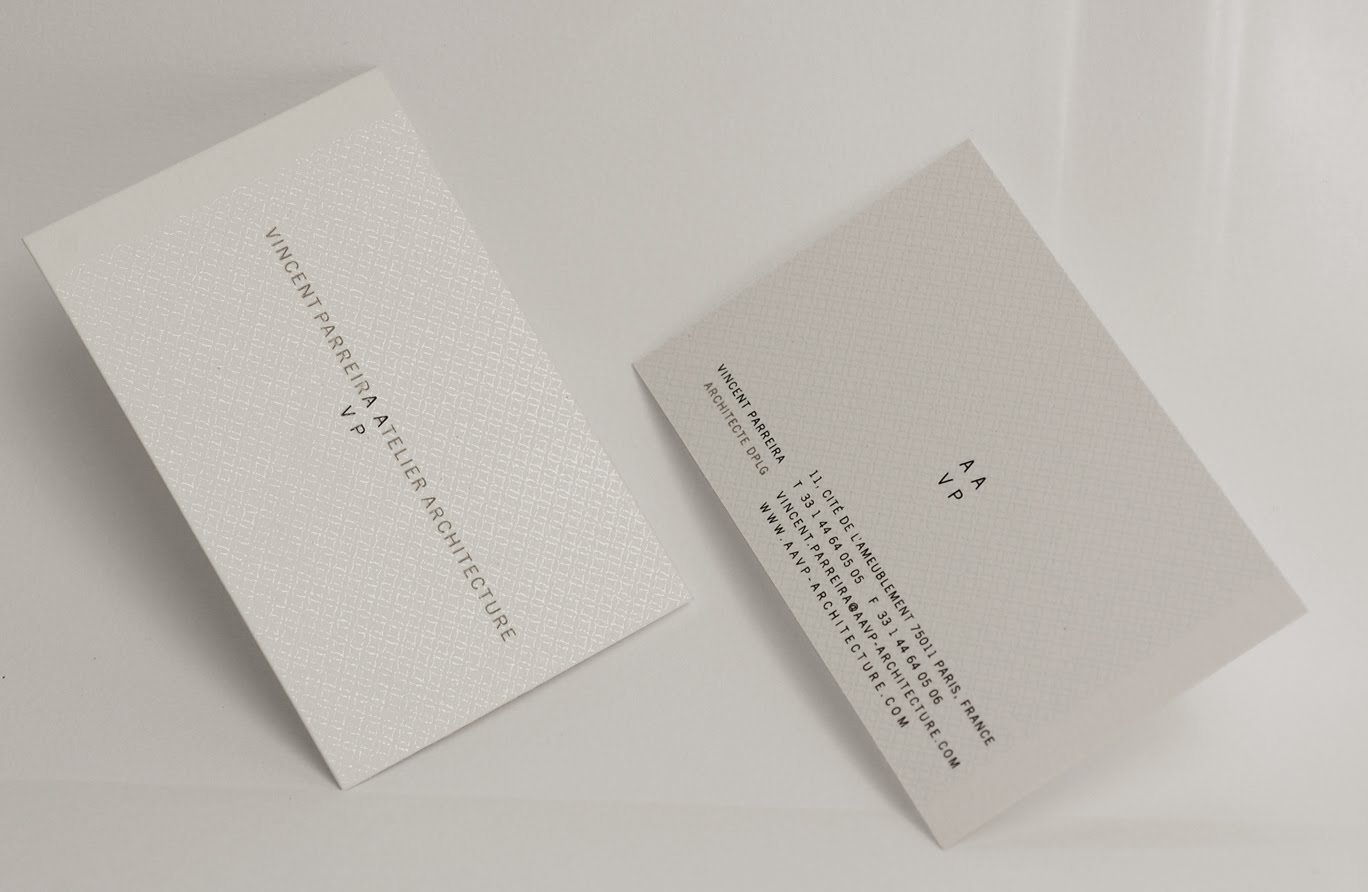
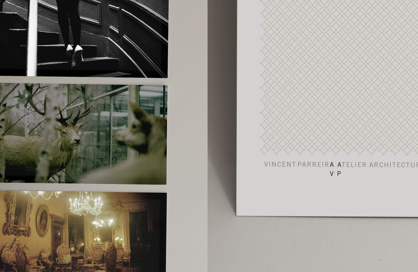
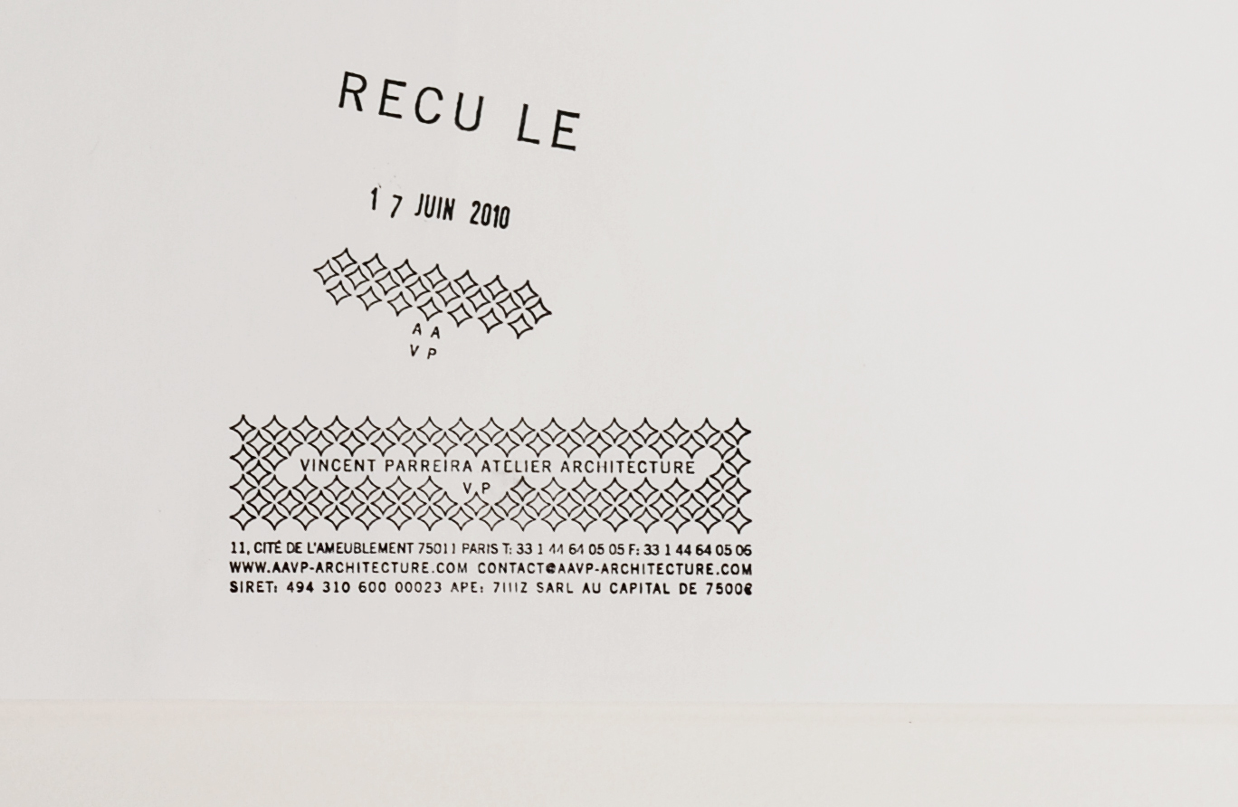
L’Atelier d’Architecture de Vincent Parreira AAVP nous a demandé de travailler il y a 10 ans déjà sur son identité visuelle. A l’époque, des post-it jaunes barbouillés d’un coup de tampon de la société faisaient office de cartes de visite. Vincent nous a donné un brief, ou plutôt un grand écart, une identité sobre ... et baroque. Un défi relevé grâce au sérigraphe Silium qui a imprimé une résille en vernis transparent, écho au bâti par l’Atelier, sur un lettrage sobre dont l’acronyme vient se perdre dans un camaïeu de gris.
The Architecture Atelier of Vincent Parreira AAVP asked us to work 10 years ago already on his visual identity. At the time, yellow post-it smeared with a stamp of the company served as business cards. Vincent gave us a brief, or rather a big gap, a sober ... and baroque identity. A challenge raised thanks to the serigrapher Silium which printed a mesh in transparent varnish, echoed to the frame by the Atelier, on a sober lettering whose acronym is lost in a shades of gray.
The Architecture Atelier of Vincent Parreira AAVP asked us to work 10 years ago already on his visual identity. At the time, yellow post-it smeared with a stamp of the company served as business cards. Vincent gave us a brief, or rather a big gap, a sober ... and baroque identity. A challenge raised thanks to the serigrapher Silium which printed a mesh in transparent varnish, echoed to the frame by the Atelier, on a sober lettering whose acronym is lost in a shades of gray.